I had been working with this client since before they purchased this space on the Upper East Side. It’s a very large two bedroom, three bathroom apartment. We had been discussing how they would like their new home to feel. They felt that it should be a white box so they could showcase there incredible art collection. I had the building plans and started working on the design for which they had asked.
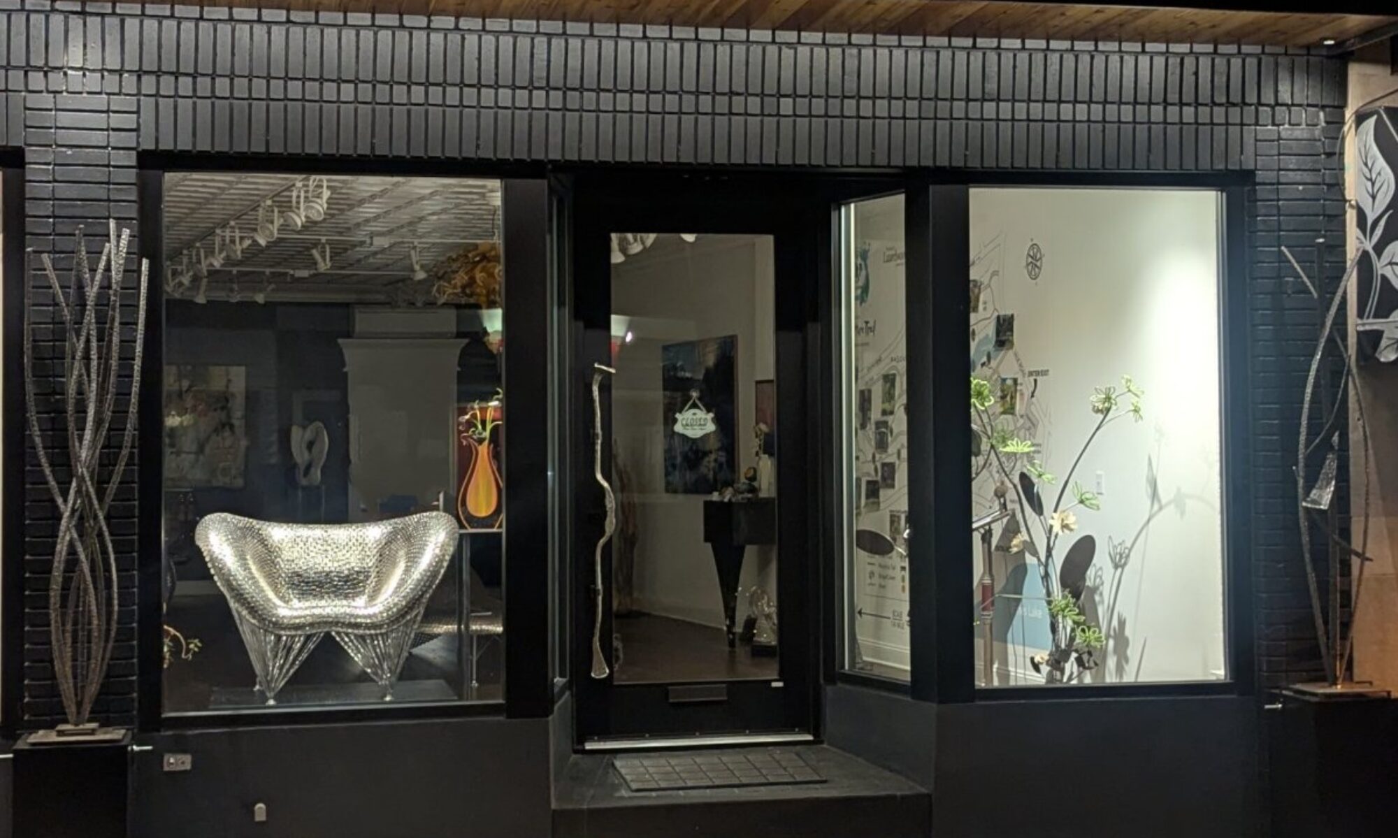
I had a meeting with them to see the space in person. As we approached the building I was stunned by what a lovely 1920’s building it was. Then we entered the lobby and I was struck by the blend of metals and patterns from the art deco period.
As I was getting out of the elevator and entering the apartment the wife told me she wanted a stunning foyer, as the husband walked into the apartment he told me he wanted a bright colorful dining room! I immediately got the two of them together and said what about the white box? Then threw out all those drawings and all those ideas!
As I gathered my thoughts, the building’s architecture ran through my mind and I began to formulate a new plan.

As you enter this large foyer, I had all the walls skim coated then chose this beautiful “Urban Bronze” semi-gloss by Sherman Williams. I had artist Andrea McKenna silver leaf the ceiling. I changed the lighting design and added this truly stunning chandelier by Best & Lloyd from London. I wanted a modern art deco feel.

Still in the foyer. You will find this beautiful custom made foyer table by Robert Koch. Notice the triangular shape of the legs and the finish on the metal, both reminiscent of the art deco period (I designed and had fabricated nine original pieces of furniture for this apartment). I chose this reclining nude and jade vase from their art collection. Also notice the light switch; there are two black toggles and one white toggle switch. This was very intentional to give this vignette balance.

In this section of the foyer you can see the beautiful parquet floor that we restored, a bench that I had fabricated and a landscape painting. This painting was chosen because it has a low vista and great depth giving balance to the entire space. The light fixtures actually came from their previous home where they were hanging downwards. In this space they were hung facing up.


Here in their dining room I chose the color “Super White” by Benjamin Moore for the ceiling and the crown molding. The walls were skim coated and then painted “Stiff Key Blue” by Farrow & Ball. From their art collection you will see a mid-century modern painting by Paul Jenkins that I cleaned and restored as well as a pop art painting to add a splash of color. The blue glass server was made by Roche Bobios in France. I wasn’t happy with the finish on the dining room table that seats ten, it had too much red in it so I had it refinished by John Richie and stained an ebony color with a high gloss finish. In the last photo you will notice a really great art deco bar that I fabricated using vintage glass from Specialized Glass Company in Dover, New Jersey as well as a chandelier from Capitol Lighting.


The living room was also skim coated and painted with “Repose Gray” by Sherman Williams. We restored and got the fireplace working. We found beautiful andirons in an antique store in France. We reworked the lighting design. This quadtych painting by Carole McDermott was purchased for this specific location. The chairs are by Natuzzi. The coffee table is custom made by sculptor Robert Koch. The teal blue sofa was chosen to make the yellow in the painting pop.


I walked into this stunning apartment the day after they had a cocktail party. I noticed there were some chairs from the master bedroom placed throughout the living room. I asked why and they shared with me that they felt that they did not have enough seating for their parties. I designed these three ottomans that are equilateral triangles. They could individually be placed throughout the living room, complimenting the teal blue couch and the two large colorful paintings. I chose the form of an equilateral triangle because you can actually sit facing in any of three directions. The gray solid velvet material was chosen to enhance the large Carole McDermott painting. As you see, they are all tucked in together and placed under this wall sculpture so when they are not in use they take up less room. Fabricated by Robert Koch and Elegant Touch Home.


In the master bedroom, the clients wanted an Asian feel. We painted the walls “Dorset Cream” by Farrow & Ball. The shades were by Hunter Douglas and had fresh water pearls and crystals hand stitched to it by Elegant Touch Home in Boonton. The sliding glass panels needed updating. I had this mural made by Murals Your Way in California. The original was a Japanese screen from the 1820’s by Sakai Hoitsu that is at The Metropolitan Museum of Art in New York City. The chandelier by Hubbardton Forge in Vermont was chosen because it reminded me of how you would tie a kimono.


My concept for her dressing room was glamour. Everything sparkles and the light bounces throughout the room. We continued the color “Dorset Cream” into this space. We put wallpaper by Dazzling Dimensions, the York Designer Series onto the ceiling. I found this crystal and amber chandelier in Miami. I removed a closet door, put in shelves and back-lit them with LED lights to display her perfume bottle collection. I designed this ottoman to fit the make-up table. It is solid velvet, hand cut crystal beads and tassels from France. It was fabricated by Elegant Touch Home and John Richie.


We used bedroom two for several months as a staging area. Then we totally demoed the entire room. We installed a wine fridge for the client’s wine collection, a large television and all the audio visual components. I had the entire room painted the same color, a soft white. The reason why I chose the soft white was to show off the client’s colorful glass collection. My inspiration for this room was a court jester. You will see the colors and forms throughout the whole room. I divided the room into two separate areas. One area is used to play cards; I installed a chandelier from their former home above the card table made by John Richie. The second area is a den/guest area where I placed a sleeper sofa from Carlyle Sofa of New York City. It is shocking purple with gray trim. Both area rugs were chosen from Jan Kath of New York City (my favorite rug store) . I then designed this coffee table. I used solid velvet colors and triangular shape legs that go in opposition to each other to enhance the court jester feel. The coffee table was fabricated by Robert Koch and Elegant Touch Home. I then installed these white box shelves from The Container Store of Paramus, New Jersey. They created a perfect vignette for their glass collection, which you can see us lighting.